Phul On Cinema, Patiala
For the age-old ‘Phul’ story, our modern take was ‘Phul On’, so we started our rebranding exercise just there. We named the theatre as ‘Phul On’ to give it a quirky touch and feel and within the premises of the cinema we conceived the design concept of a restaurant known as ‘Phul On gabru. Now this ambient and extravagant space is based out of Patiala, so we played our design idea around ‘phulkari’ to give it a regional touch. The menu, the packaging, design space for both the cinema and the restaurant retained the classic taste of Punjab for relatability and quick minimal design features for quirk to achieve our vision of modern classic!
The extravaganza in space design for a holistic brand identity was the core component for our design markers. You must remember the space for the story it entails and the prospective joy you will receive after entering the premises. You must feel ambient royalty and golden gravitas when you enter the domain of ‘Phul On’- that is what we went with and it gave the project great heights from a relatable and creative angle!


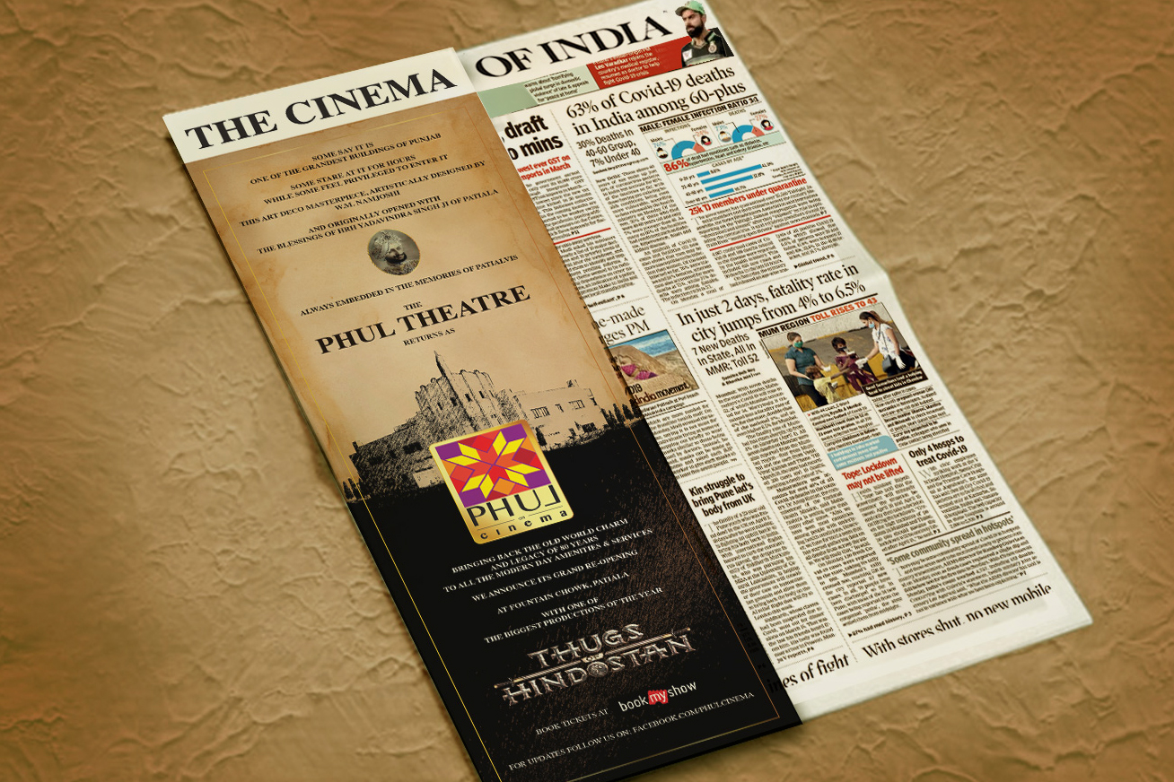
We also incorporated a ‘Phul on’ print marketing design in the creation of the visual narratives of the space, from print to digital campaign, we made sure that people could tell that something new is cooking in the town!
An explosion of the Punjabi colorful culture was the core instinct of the design value we rendered for Phul-on Cinema; in the covers of monochrome newspapers, we added the cover of an extravagant color for the ultimate pop brand identity blast!


Next we worked on space and wall design. To be able to make a quirky message, we built upon a mix of street based common quotes fixed upon classic Punjabi style. Our one point motive was creating a visible and relatable identity drive for the client.
We designed the intensive menu for the client bases. The intense hues that we picked from the Punjabi culture, a bright collectible of pink, blue, green and all the primary segments was our first choice for the visual design space.


In addition to that, we also rendered other internal and external communication design works. We designed the business cards and other print collaterals for the client- the idea behind these were a blank basic hue with a half original visual spread- brilliant and pop!
